
Connecting Coloradans to Education, Careers, and Resources
—
PROBLEM
Various agencies within the Colorado state Government were running digital solutions disparately, creating a confusing experience for residents. The mission was to create an experience that wove all of these state agencies together into one that Colorado residents would come back to time and time again, throughout their lifetime.
How can the State of Colorado improve its digital platforms to better serve residents?
SOLUTION
The mission was to create an experience that wove all of these state agencies together into one that Colorado residents would come back to time and time again, throughout their lifetime. The state stakeholder team set an intention–we want to serve Colorado residents from 9-99–connecting people with the resources the state of Colorado has to offer them.
ROLE
Lead UI/UX Designer
DELIVERABLES
Design System
Web Application
TEAM
Creative Director
Product Designer
Product Manager
Engineering Manager
TIMELINE
6 months to initial product launch
Combined Sprint and Waterfall approach
Project Process
—
Persona Definition
User Flow Diagramming
Wireframing Feature Solutions
Brand Analysis
Visual Design Exploration
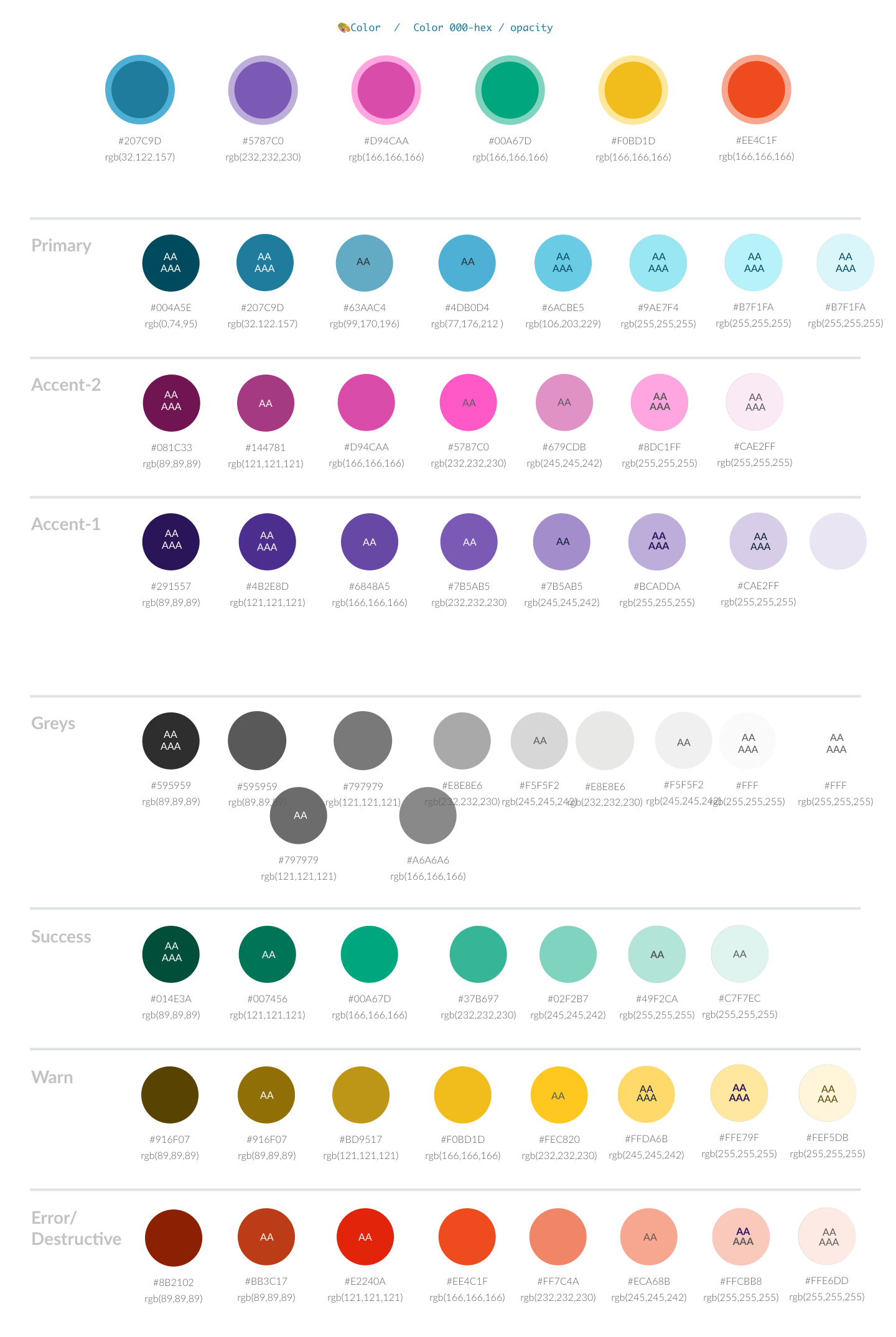
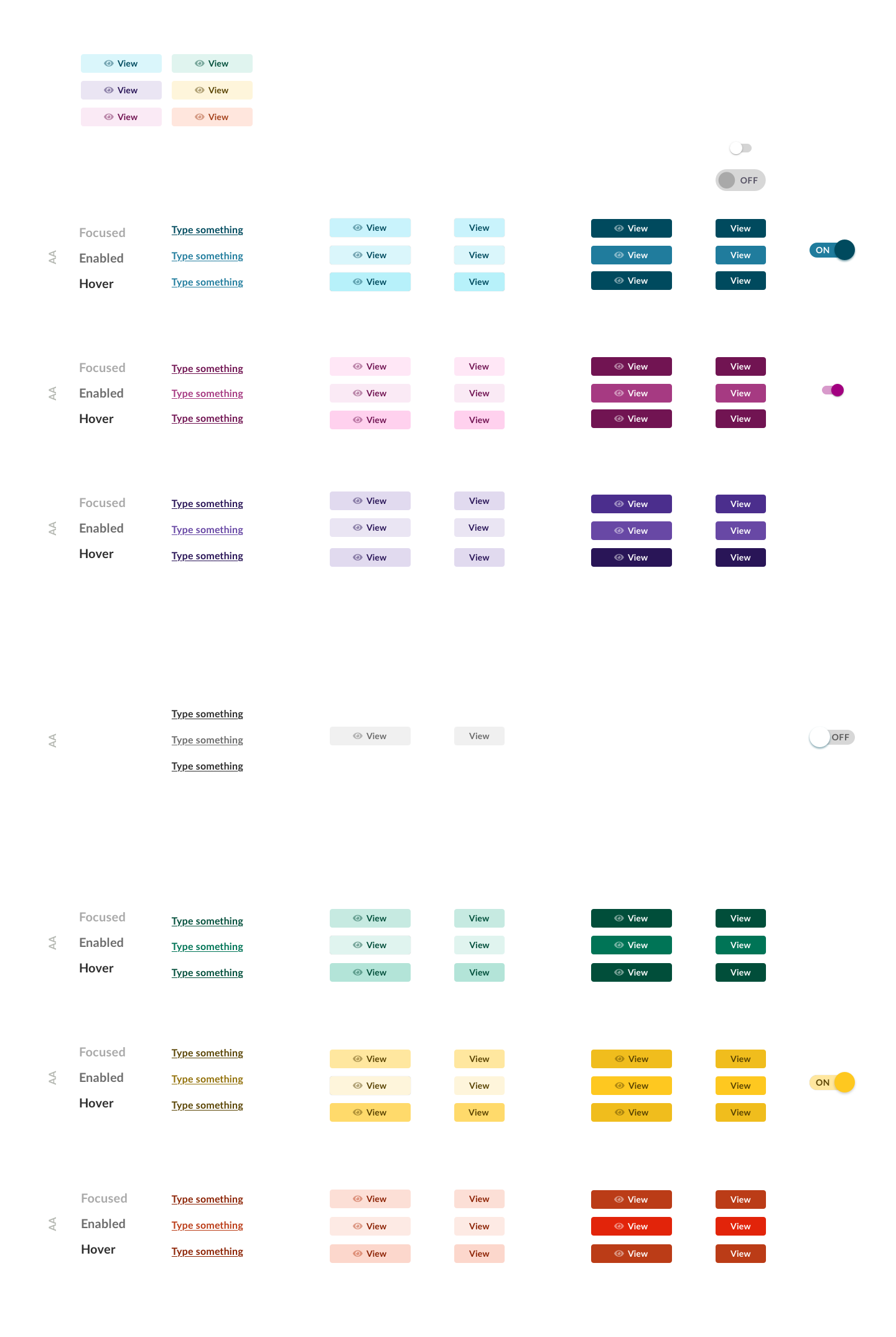
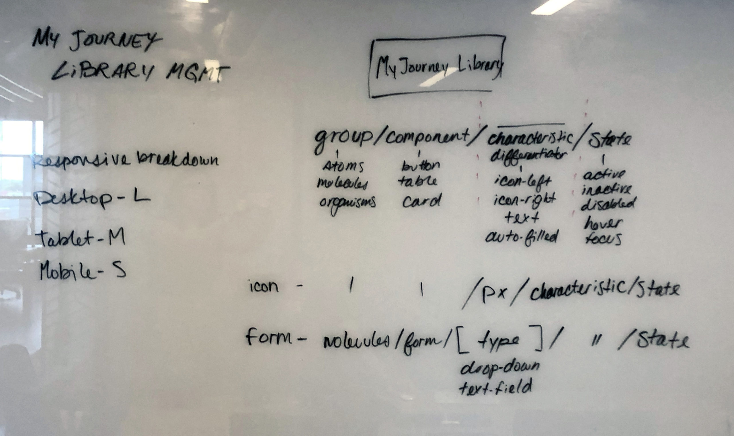
Design System Development
I worked with my Creative Director to determine essential user flows we would focus on during the initial launch of My Colorado Journey. I was responsible for working with the team to help define core feature architecture and logic. We worked with a partner agency whose brand guidelines we would follow. While the architecture of the app was being determined, I developed visual design solutions that aligned with their brand.
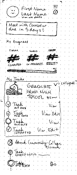
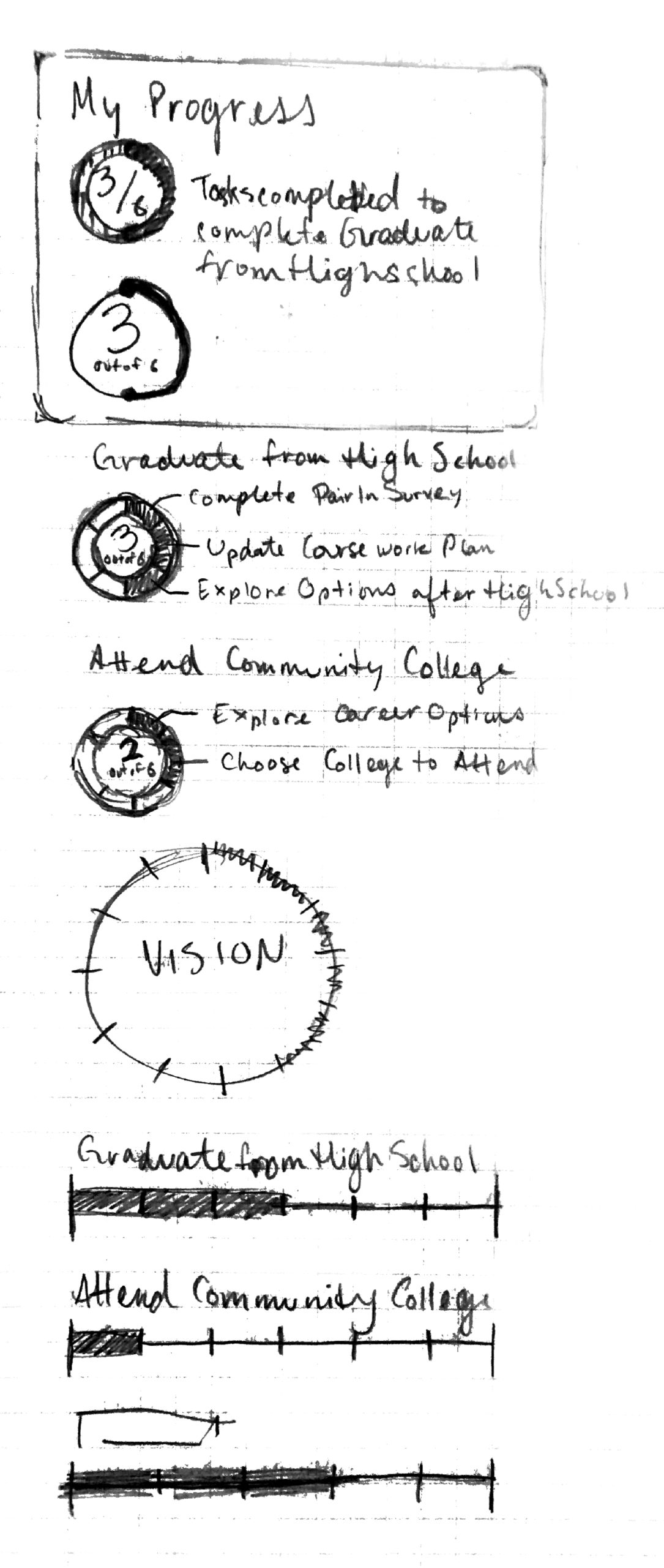
Pictured is an initial sketch of the app's core feature which we later named Outcomes, Goals, and Steps.


Early Development
—
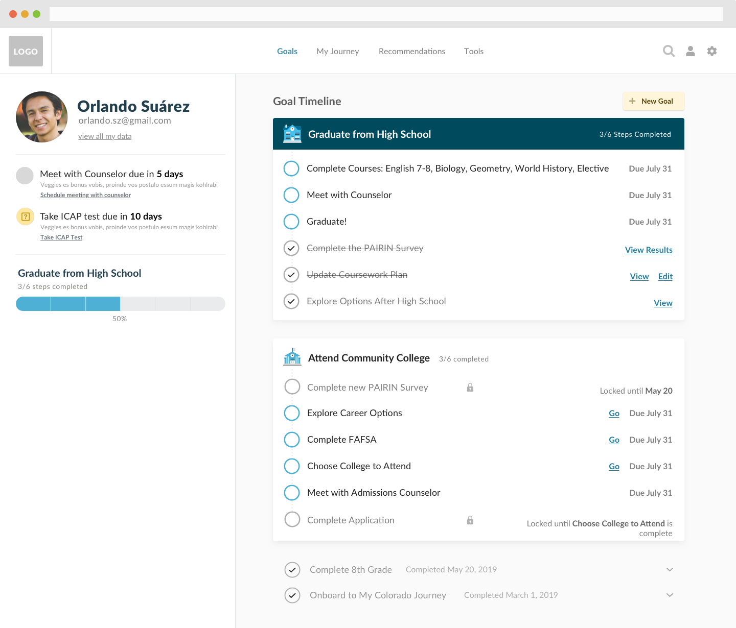

An early iteration of the My Colorado Journey Dashboard
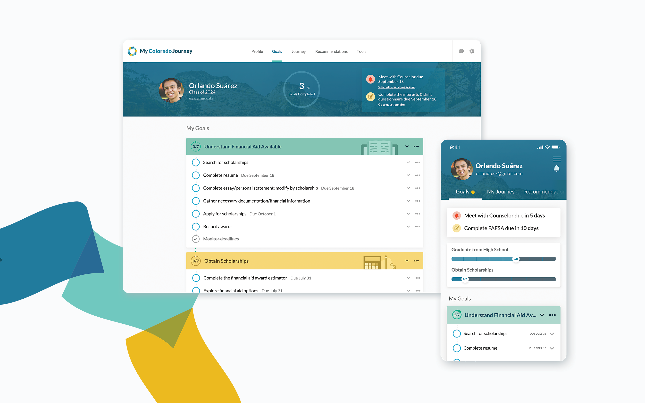
The main focus for the initial release was to launch the Outcomes, Goals, and Steps view and the My Journey view.
My process for developing visual design solutions combined analysis of similar applications. I looked at applications aimed at productivity (task apps), education (language, vocabulary learning), and data visualization (banking). After researching a wide breadth of competitors, my goal was to ensure the resulting application was familiar, trustworthy, and approachable.


A concept for selecting a pathway within My Journey view. Users would select Outcomes they might be interested in or are already working on. Users would then explore potential pathways they could explore based on current selections. Our goal was to build logic that would guide users through recommended pathways based on the combination of outcomes they had selected.
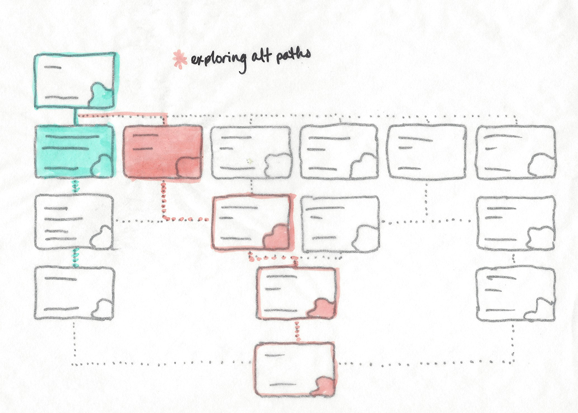

We worked with the Product and Engineering Director to build a proof-of-concept for the pathways concept. It was technically feasible, but ultimately we needed to simplify our approach into something the engineering team could build within the MVP timeframe.
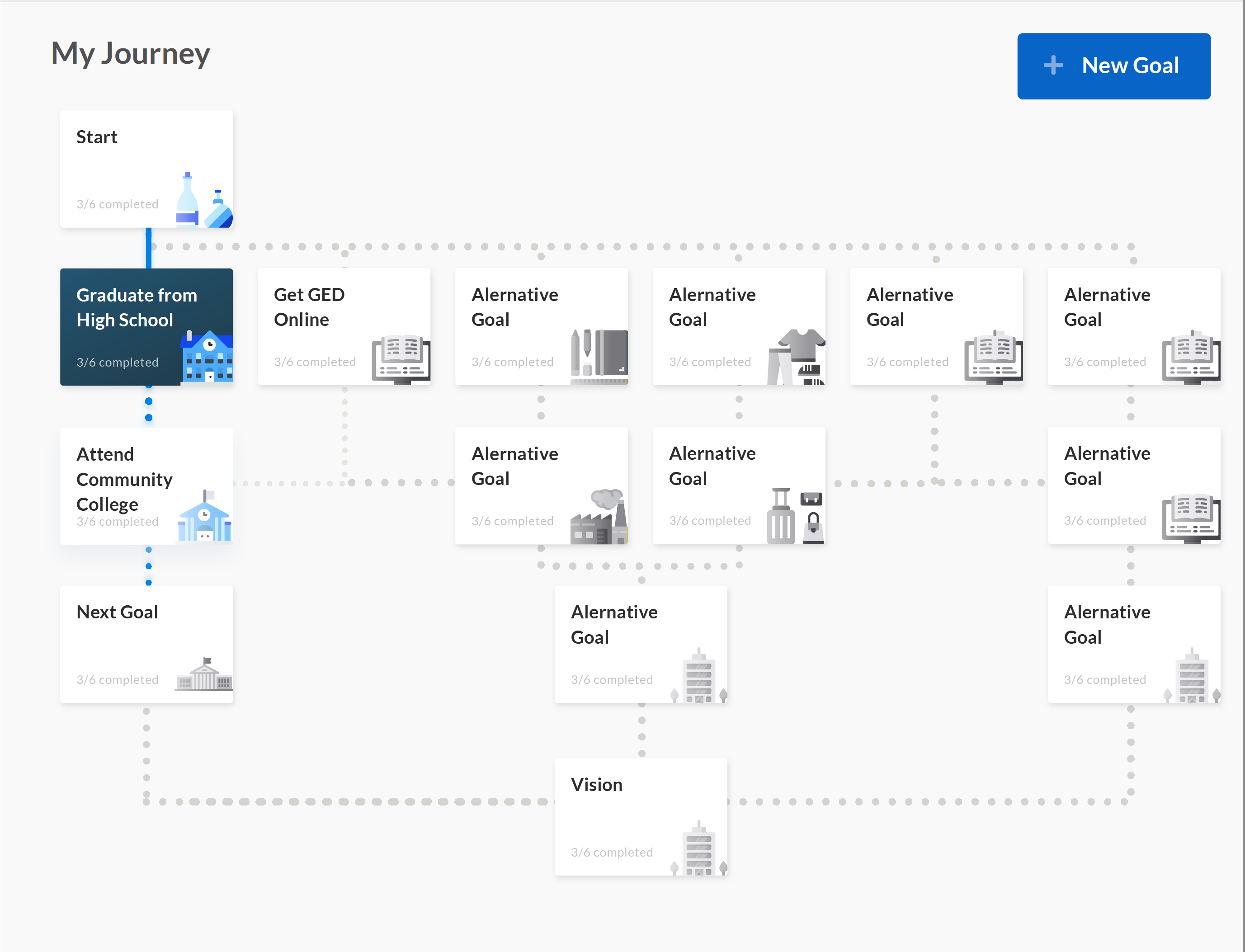

Visual Design of pathways concept
Outcomes, Goals,
and Steps
MVP View
Outcomes, Goals, and Steps became the primary content structure for My Journey. Working with the State of Colorado's subject matter experts, a library of content was developed based on the primary persona: Orlando (middle-school, English as an additional language).
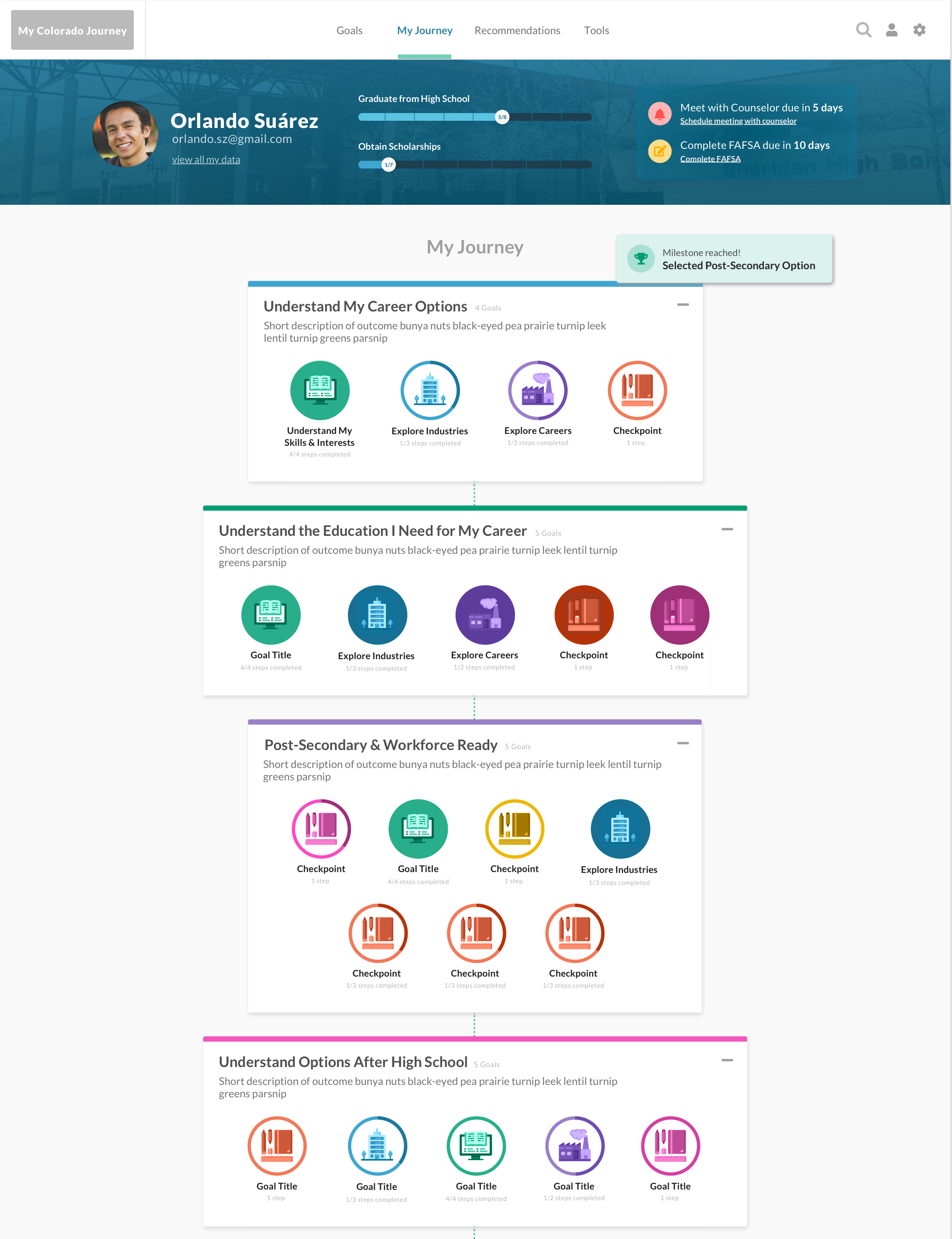

Initial Launch version of My Journey view–This view was restructured after Product de-prioritized Outcome logic, moving forward with a prescribed flow based on user persona


Exploring icon styles in context


Exploring meta actions
Design System
—
