
Creating Intuitive Navigation for Spotify Ads Manager
2022, 6 months
Design Lead

Spotify's Self Serve ads booking experience, Ads Manager, launched in 2017. Since then, Ads Manager expanded into global markets, built various ad formats, and made it possible for teams to collaborate within the platform.
Ads Manager navigation was sparse, burying critical user tasks and leading to low completion rates. We set out to improve the Ads Manager user experience and prepare the product for upcoming waves of innovation.
The circuitous routing of complex ad creation and reporting was keeping advertisers from using many of Ads Manager's new, powerful features.
Unpredictable interactions created confusion, reducing the likelihood of successful task completion.
Task completion was tracked with an extensive measurement framework centered around Create, Manage, and Admin behavioral modes. At the time of this initiative, task completion per mode was as follows: Create Mode - 34%, Manage Mode - 12%, Admin Mode - 19%.
Our hypothesis was to expose clear paths to actions within Ads Managers’s top 3 behavioral modes (Create, Manage, Help) to enable better wayfinding, team collaboration, and task completion by improving navigation across 1st and 2nd-level surfaces.
We devised a navigation framework that made it easier for advertisers to publish campaigns, measure performance of their campaigns over time, and manage billing seamlessly within the context of an ad account.
I began by auditing the existing Ads Manager structure, prioritizing revenue-driving tasks: campaign creation and management.
Campaign Table
While creating campaigns was straightforward, creating an ad set or individual ad was circuitous. Additionally, many critical tasks were hidden within campaigns or accessible only through hover actions on the table.

Ad Accounts
Ad Accounts provide the primary context for users. In the previous system, navigating to your ad account was confusing. For instance, a marketing manager at an agency handling multiple clients would require different levels of access for each account. The navigation needed to accommodate this complexity.

Notifications
Notifications were treated differently throughout the platform. Different types of notifications would live across the experience, crowding the experience. while others were only available on the campaign table. The positive about notifications was they enabled quick access to features like billing while the navigation obscured access. We looked to improve this band-aid by elevating access to key tasks.


With a clear understanding of the existing system, I collaborated with a Content Designer to analyze key tasks within Ads Manager. We:
- Mapped over 50 user tasks.
- Conducted a heuristic analysis of how tasks were represented.
- Evaluated task completion paths (happy paths vs. actual user flows).
- Developed a task matrix to simplify user flows and identify areas for improvement.

Spotify Advertising used user archetypes in place of personas, which layers on market segments and marketing funnel goals, highlighting user behavior regarding advertising spend, in relation to Ads Manager.

We found that key tasks like adding billing information and measure campaigns were sometimes buried under four or five levels of navigation.
We tested different UI layouts, including:
- Bringing the Ad Account and User Account into closer proximity.
- More affordances for the current state
- current view is highlighted and current ad account is called out
- Making notifications globally accessible.
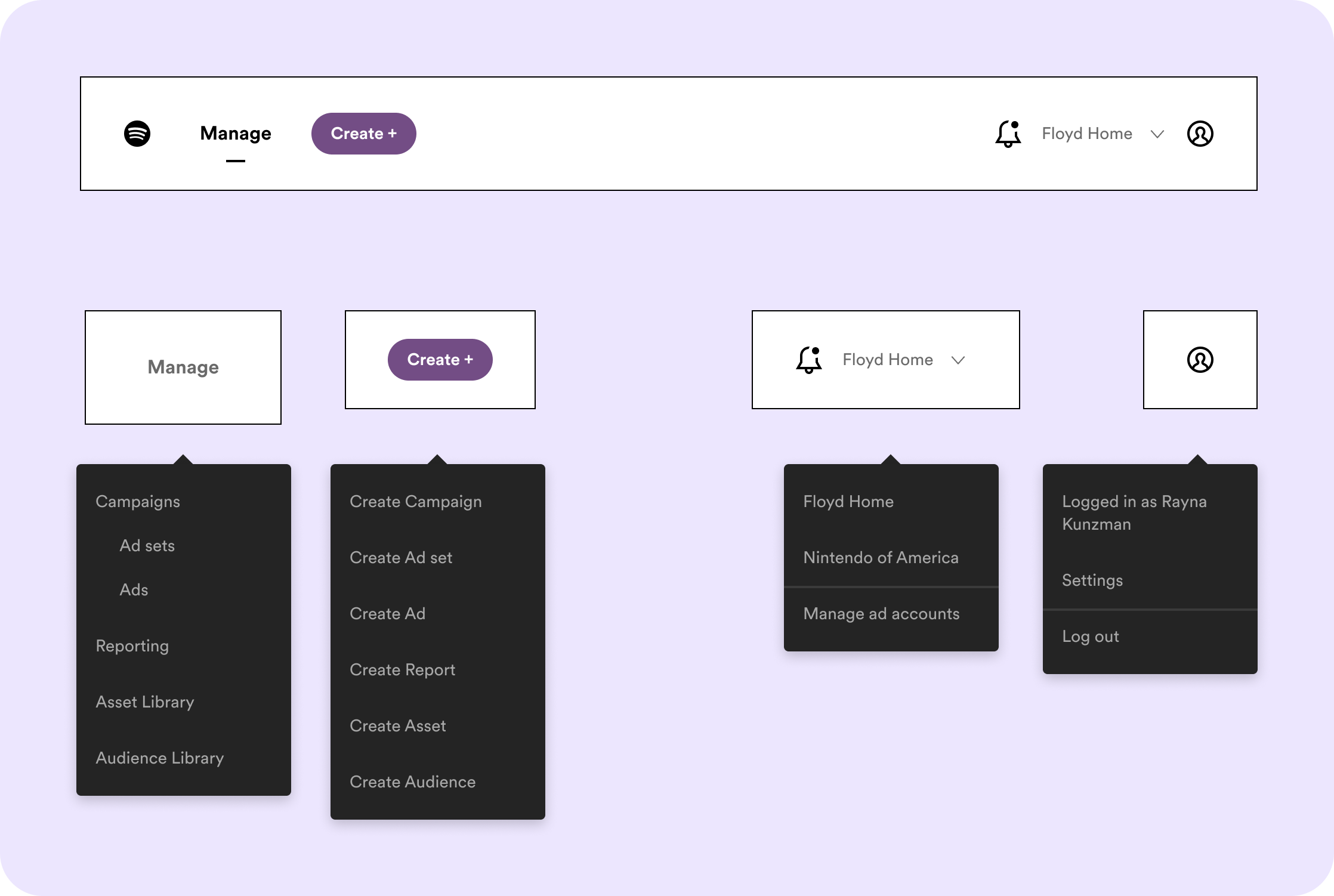
Initial UI explorations included planned features such as more robust reporting features. Here, we see the Ad Account and User Account in closer proximity. There are more affordances for the "current" state, i.e. the current view is highlighted and the current ad account is called out. Notifications are now accessible globally.
The main downside of this nav solution is the horizontal orientation – we quickly run out of room. We explored a vertical navigation solution as a more scalable option, as well as being in line with other internal Spotify products.
Due to engineering priorities at the time, we had to continue with the horizontal navigation. However, the team has since transitioned to a more flexible, vertical navigation system.
We knew the longterm viability of the horizontal nav was limited – adding more than 4 navigation items crowds the navigation, made worse when translated.
Overview label doesn't move the needle
We explored grouping all functionalities under an "Overview" tab but ultimately found this approach ineffective. Instead, we focused on integrating "Create Campaigns/Ad Sets/Ads" into the global navigation to support future reporting and optimization features.

Task modes & localization considerations
We tested mirroring navigation labels to behavioral modes (Manage, Create) but encountered challenges with localization. Translated labels in languages like German and Spanish were too long for a horizontal layout. We pivoted to noun-based labels for clarity and scalability.

Scalable Groups for Future Growth
We structured the navigation to:
- Group critical user actions intuitively.
- Reduce cognitive load by minimizing the number of main nav items.
- Align with users' mental models.
- Ensure scalability for future features like A/B testing and optimization tools.
- e.g., "Performance" could house existing features like Reports, Audience Insights
- Maintain consistent naming conventions to support localization.
Below we see the navigation concept broken out three ways: content strategy, sitemap/information architecture, and UI exploration.
After workshopping solutions with other Ads Manager teams, we collaborated with a UX Researcher to validate our concept through a tree test. The refined navigation framework successfully improved wayfinding, enabling advertisers to:
- Publish campaigns more efficiently.
- Measure campaign performance seamlessly.
- Manage billing within the context of an ad account.


- Information Architecture Analysis
- User Research
- Design and Content Ideation

